The Design Challenge
Menopause is a major life change, yet it's often misunderstood and surrounded by stigma. This challenge is about creating a brand that makes menopause a topic of empowerment, not silence. It should raise awareness, educate all ages, and be grounded in solid research. The brand must bring fresh, unexpected ideas to change perceptions and spark real conversations. Through bold storytelling and innovative design, it should reposition menopause in a new, engaging way that challenges outdated views.
About
Clarity is a menopause awareness brand designed to help women understand their bodies and provide essential support. Its mission is to ensure no woman misses out on crucial education, treatment, or resources—especially since 45% of women don’t even realize their symptoms are menopause-related.
Targeting women in their 30s, Clarity empowers them with knowledge early on, so when menopause arrives, they feel informed, prepared, and in control.
Tools Used
Adobe Suite
Year
2021
Project Type
Branding, Merchandise and Editorial
Design Process
-
To understand how menopause is explained to women, I explored existing campaigns, podcasts, and TV shows that discuss the topic in depth. I also reviewed statements from doctors and interviews with health professionals to gain insight into what women already know—and what they don’t.
Beyond awareness, I analysed the product market to see what support exists, including pre-menopause tests, supplements, and symptom management solutions. Recognising that every woman’s experience is unique, I looked into a range of symptoms and how they vary from person to person.
To deepen my understanding, I conducted a survey with women of all ages, gathering firsthand experiences on their struggles, knowledge gaps, and the remedies they found effective—whether herbal, organic, or natural. This comprehensive research shaped the foundation of Clarity, ensuring it truly addresses women’s needs.
-
Throughout my research, one word kept standing out—clarity. Clarity on symptoms, clarity on preparation, and clarity in understanding menopause. It became clear that what women needed most was a deeper, more accessible understanding of this life stage.
The name Clarity was inspired by a striking statistic from Nuffield Health’s survey: 45% of women did not realise that the symptoms they were experiencing were menopausal. This finding truly shocked me and reinforced the need for a brand that informs, supports, and prepares women for menopause.
From this insight, I knew a branded product was essential—something designed to educate and empower women, ensuring they no longer feel confused or unprepared for this transition.


Design Solution
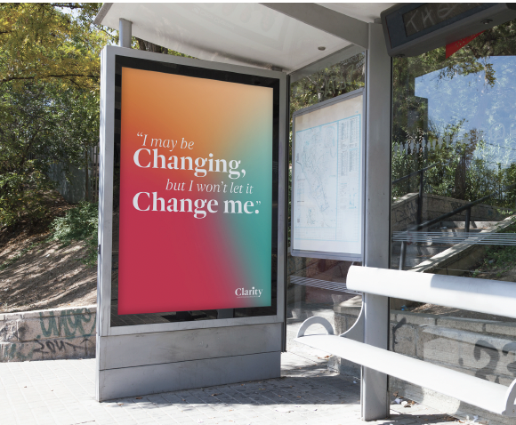
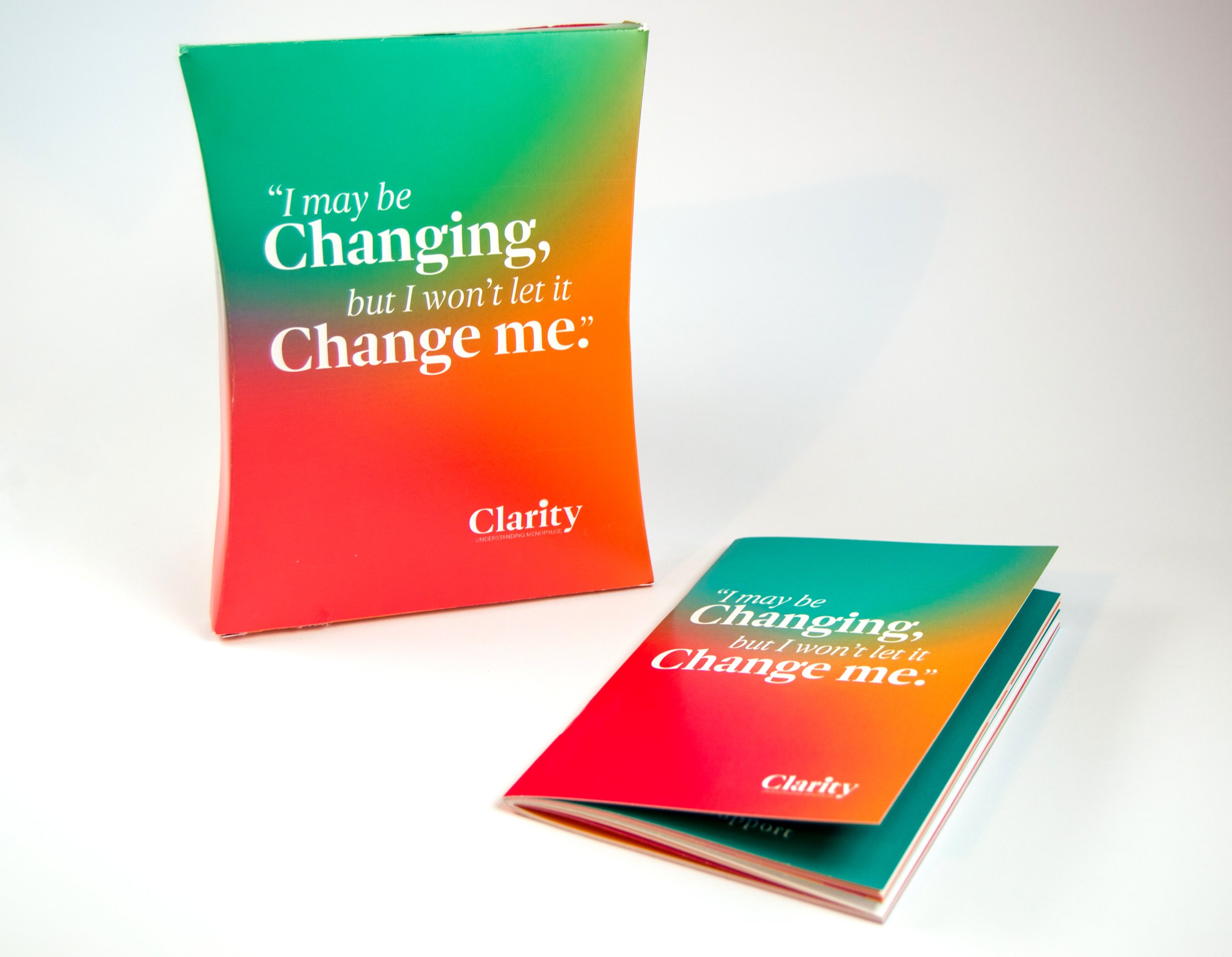
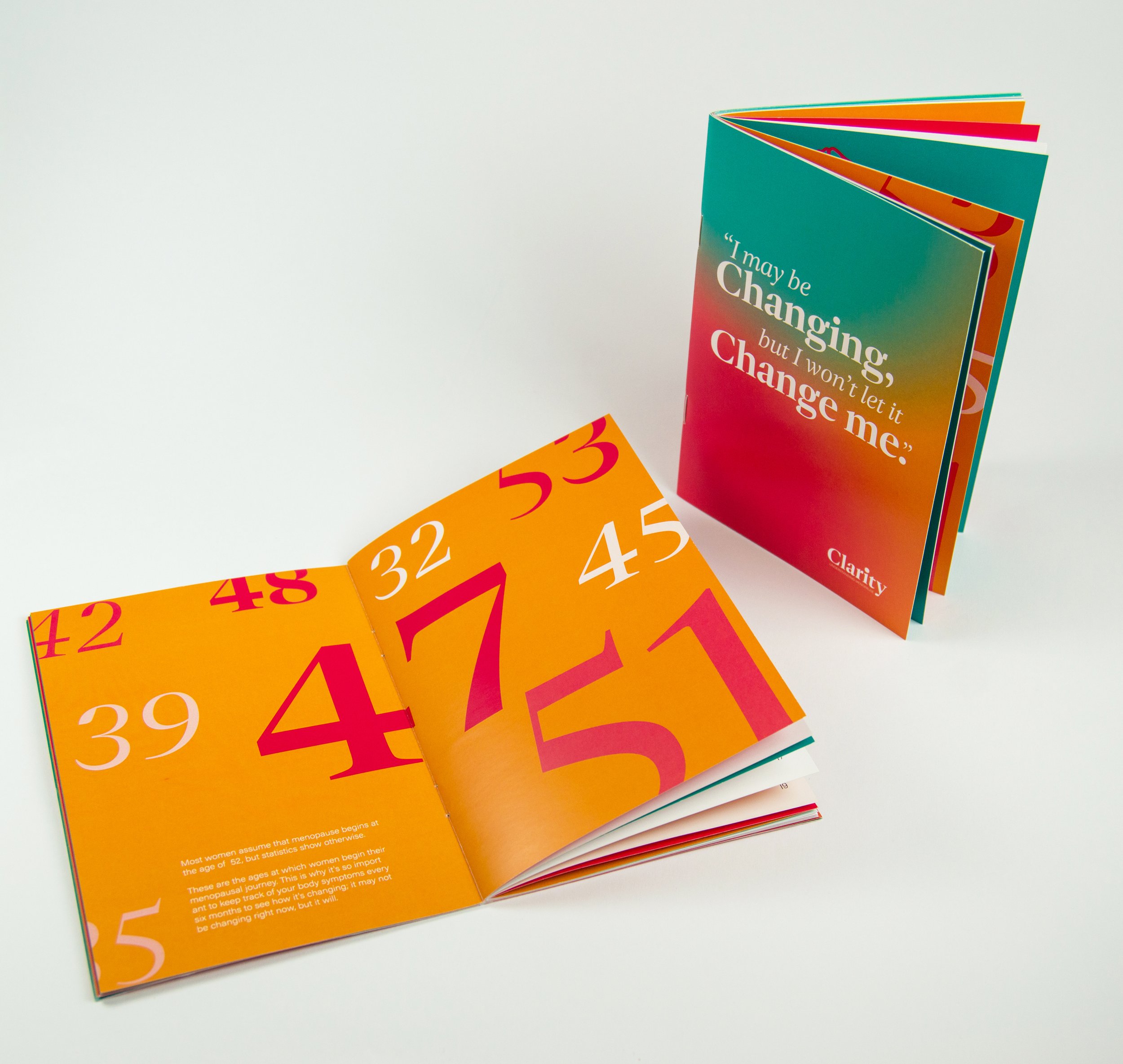
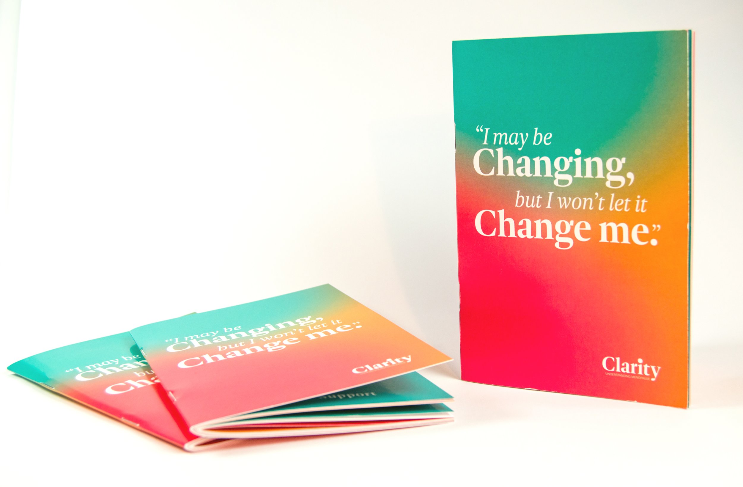
Clarity is a menopause brand that empowers women through perimenopause and menopause by offering expert support, community connection, and health tracking. The app features self-guided programmes, symptom logging, and personalised insights. Alongside the app, Clarity offers a menopause testing kit with a test and a 44-page informative booklet full of expert advice, inspirational quotes, and tracker sheets. An Instagram page provides easy access to key information and valuable insights, while Ad Shell posters in bus stops and shopping centres help normalise menopause awareness.
The name Clarity was inspired by a statistic from Nuffield Health’s survey—45% of women don’t realise their symptoms are menopausal. This insight shaped the branding, which features a subtle blur in the dot of the "i" to symbolise uncertainty. After refining the colour palette from a hot pink to a more resonant shade and using clean typography with gradients, the design remains clear, effective, and approachable, ensuring the brand resonates with its target audience.